ELATION
PROPERTIES
Video: Silver Lake Crossing (edited by me)
For the past two summers, I've been working as a Graphic Design Intern for Elation Properties, managing over 15 brands for apartment buildings across the midwest. As the company has grown, I've had several opportunities to create branding for properties, shown here in my case study for rebranding a South Dakota apartment community.
THE OAKS
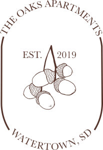
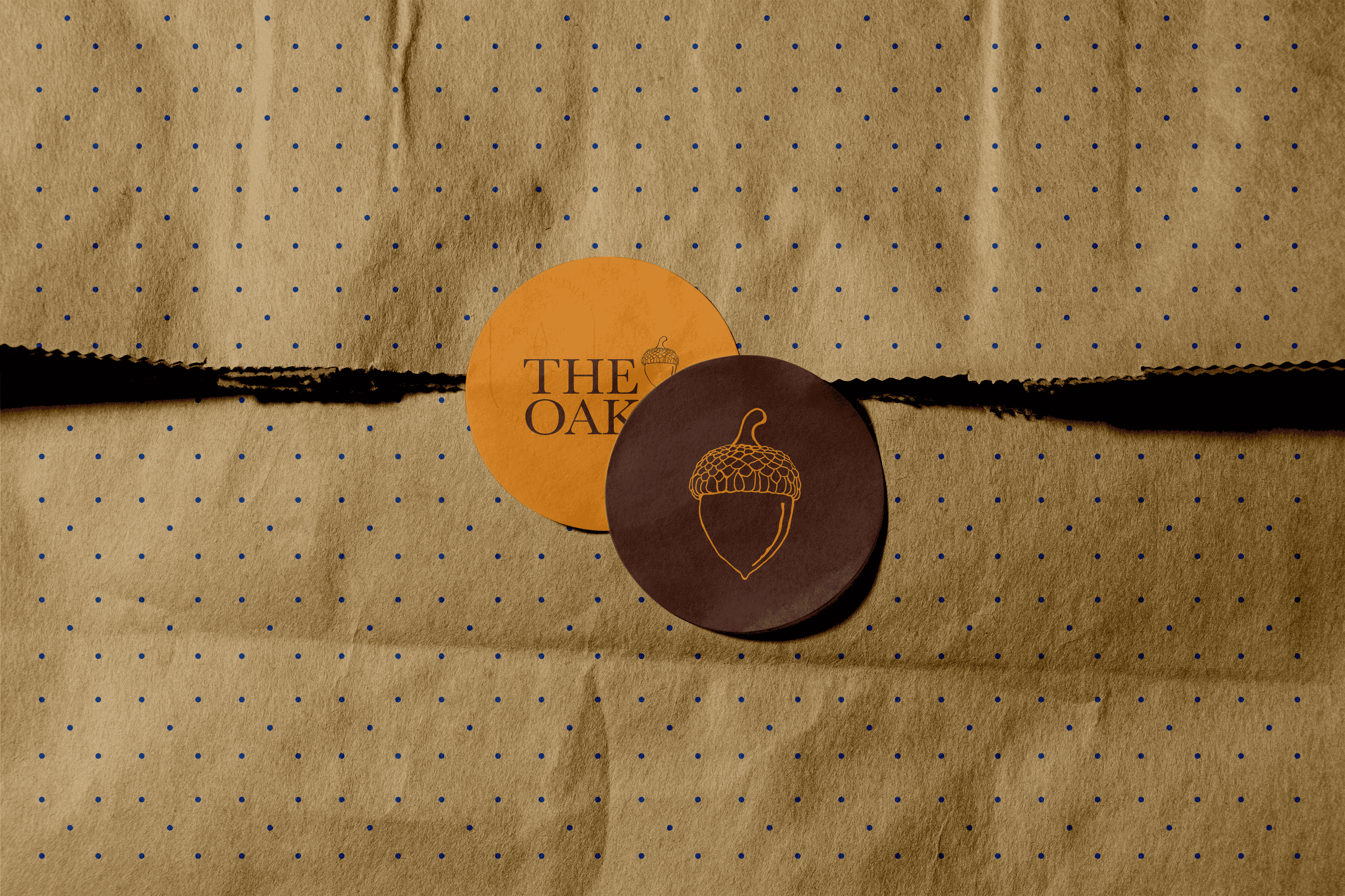
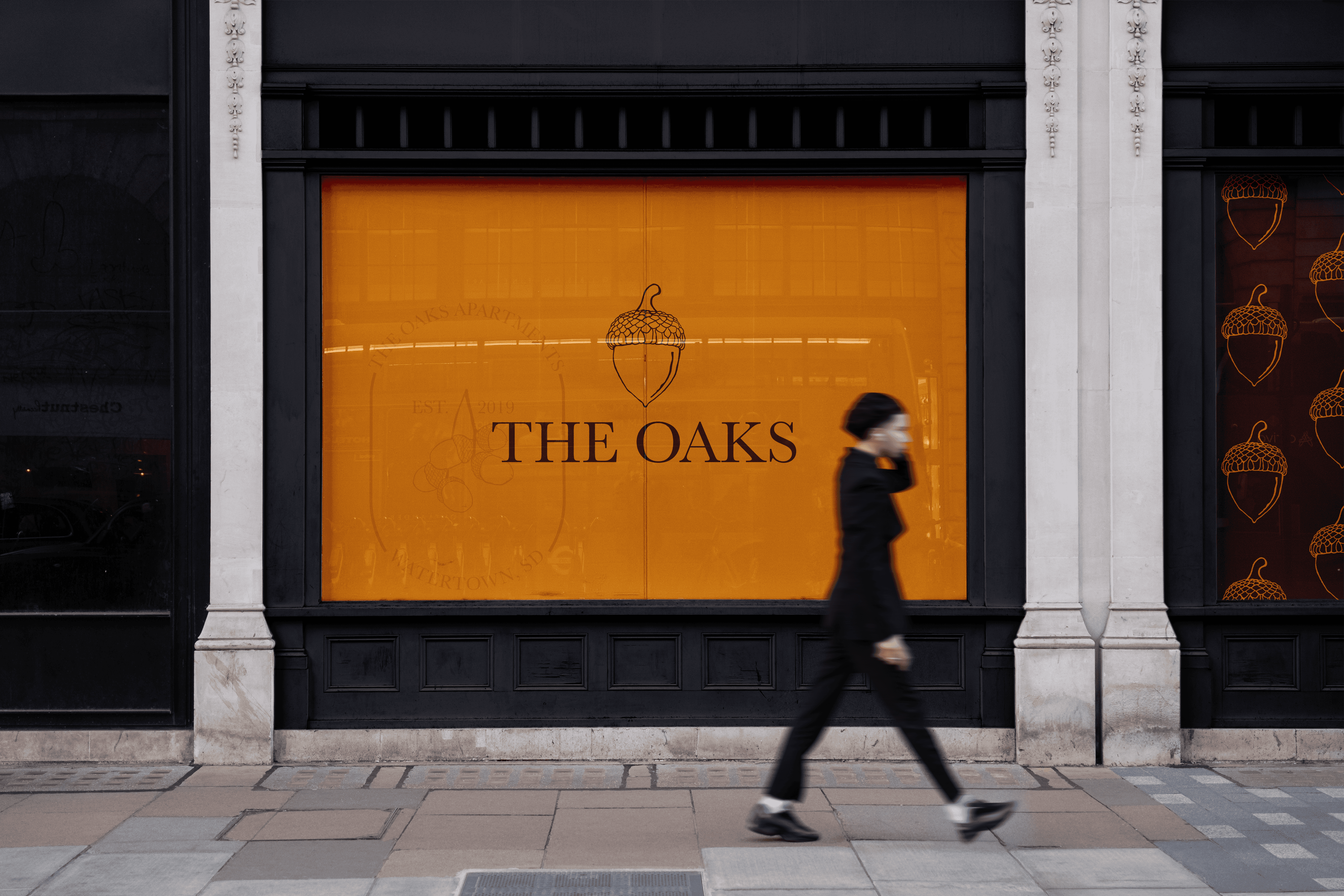
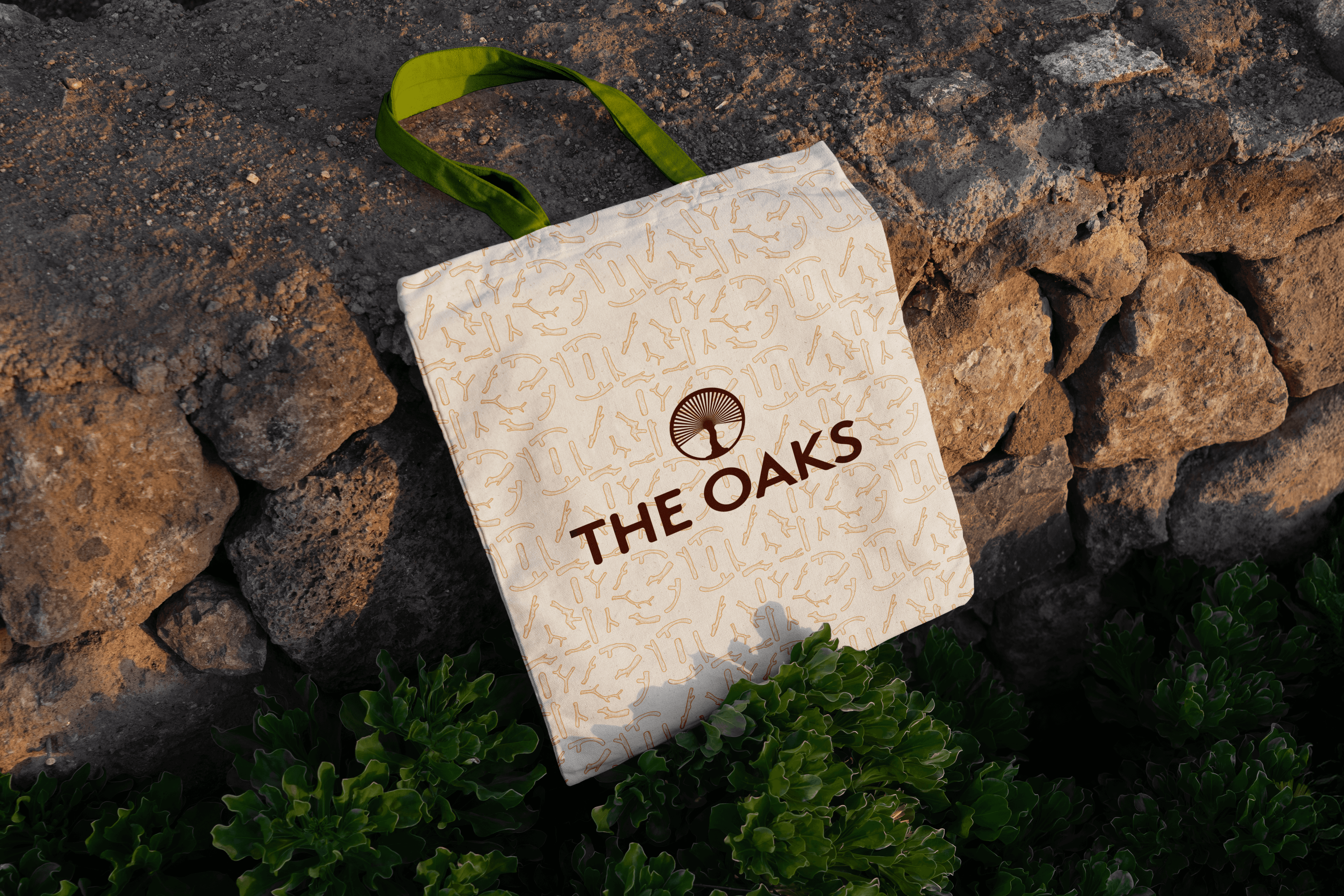
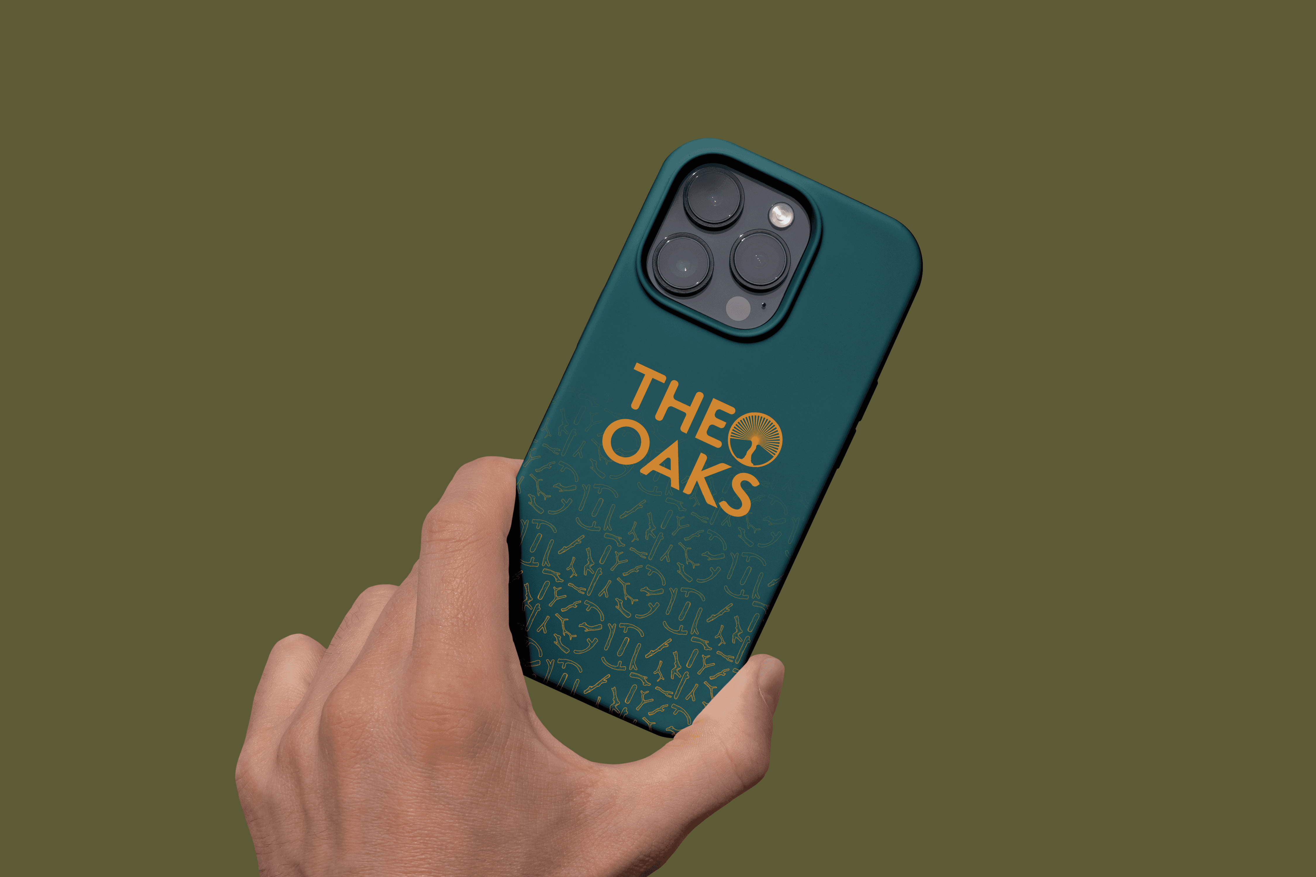
This summer I had the opportunity to rebrand an identity for a whole apartment complex, anticipating the next building coming next June! For this effort, I built 3 fleshed out brands and presented them to the marketing department and ownership, with one brand becoming the new identity in the end.
THE OLD BRAND
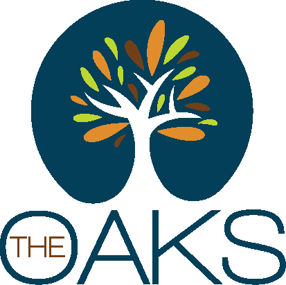
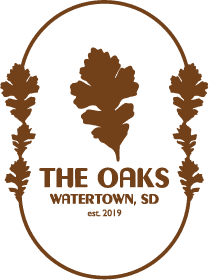
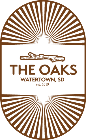
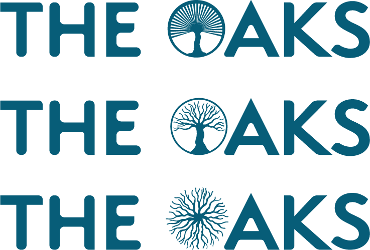
Built in 2019, this brand was due for a refresh. The multicolor logo and thin wordmark were hard to scale, and the color pallette was hard to work with. Needless to say, when the VP said it was time to rebrand, I was more than happy to take it on. He said the brand needed modernization, a refresh for today. I took three different directions for this project: the Acorn, Leaves, and Branches.
043F59
703F19
BDD632
E18D2D
353626
075458
55342B
9EAF09
E18C2B
54512B
THE NEW PALETTE
I didn't want to change everything about the brand, as the building itself inspired the old brand, so I instead refreshed the colors to be bolder and more confident.
ACORN





LEAVES



STICKERS


BRANCH



PATTERN

WHICH CONCEPT WAS CHOSEN?
All three directions went in front of the owners. Tap the concept you think won.
ACORN
LEAVES
BRANCHES
MORE FROM ELATION






David Bomhoff